In preparation for the 2004 Summer Olympics, Nike commissioned a promotional site featuring key members of the US National Women's Soccer Team. Our challenge was to make a the site feel like a destination worth returning to.
Nike Soccer
In preparation for the 2004 Summer Olympics, Nike commissioned a promotional site featuring key members of the US National Women's Soccer Team. Our challenge was to make a small site feel like a destination worth returning to.
1. Context
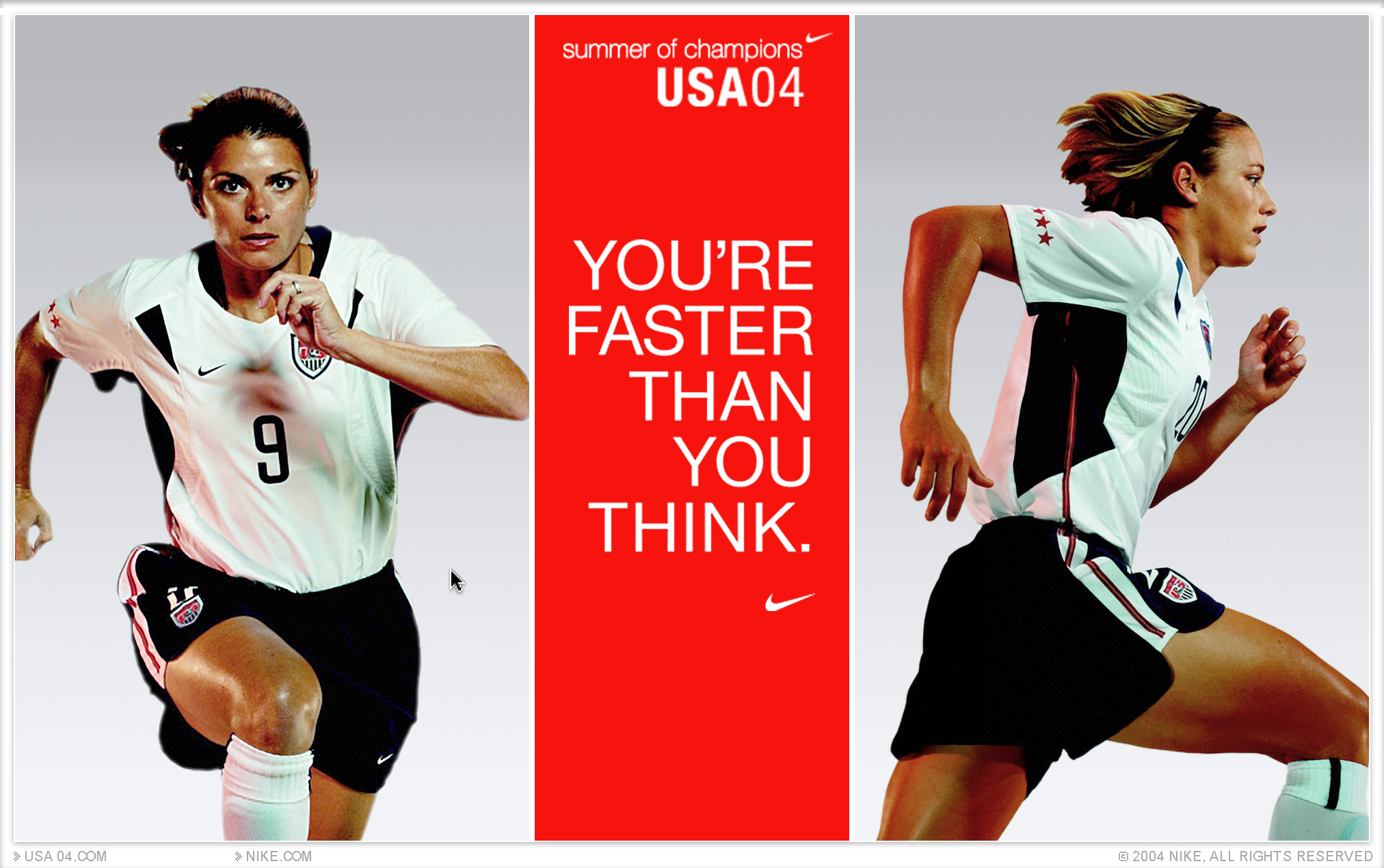
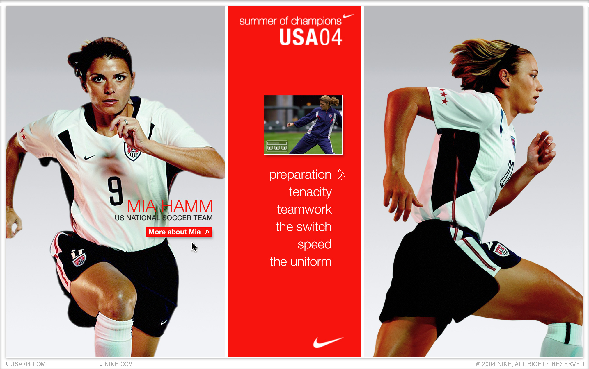
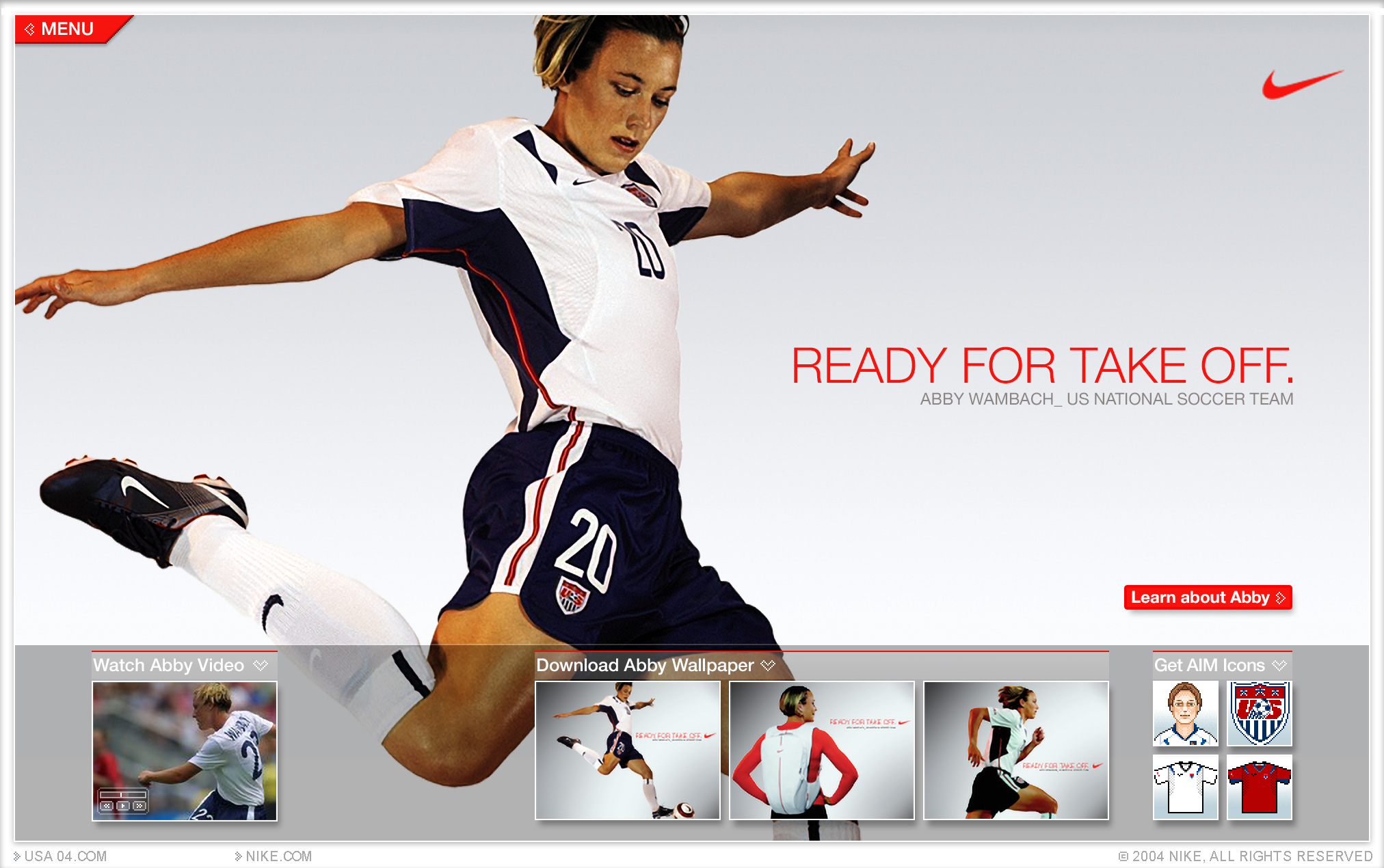
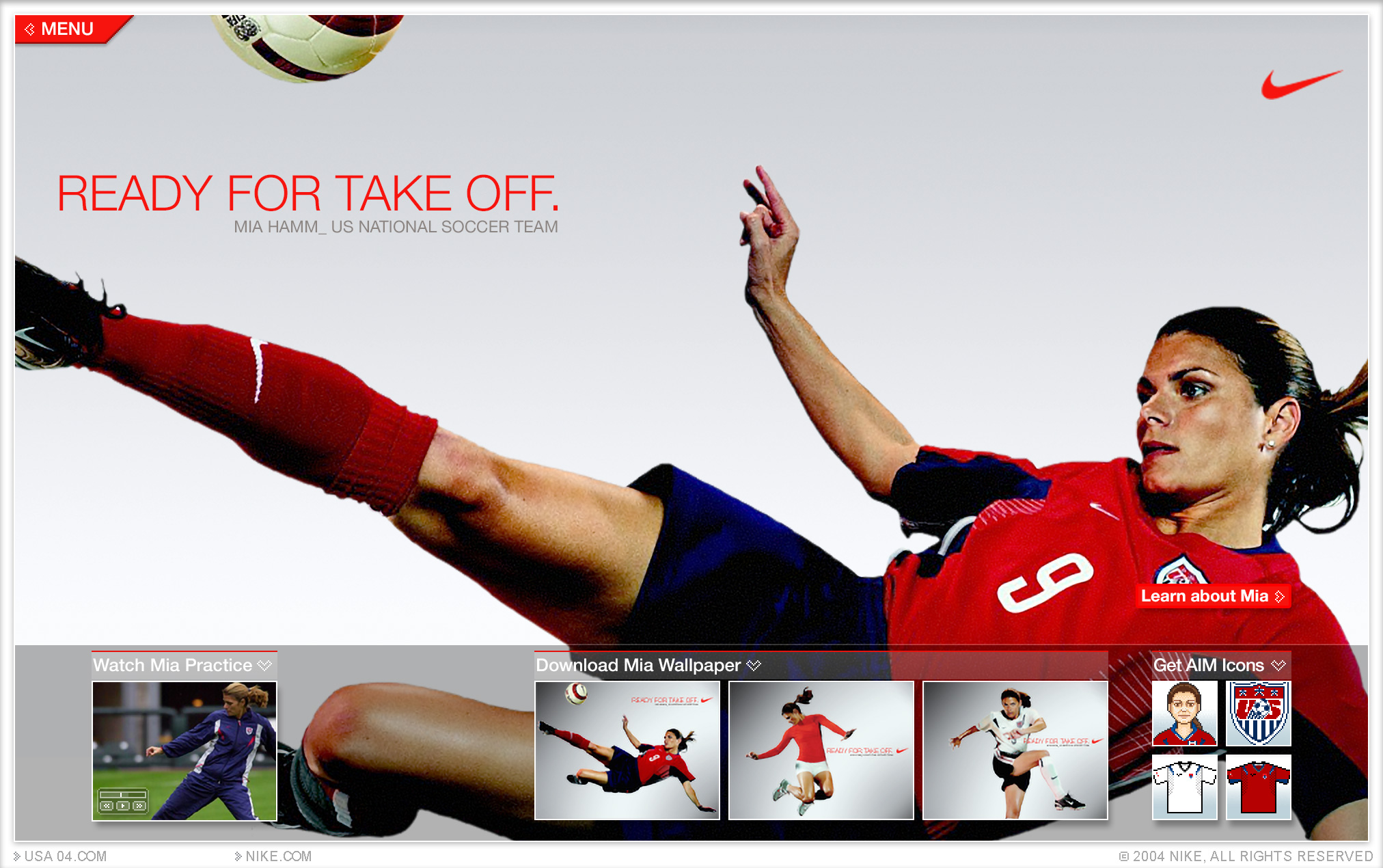
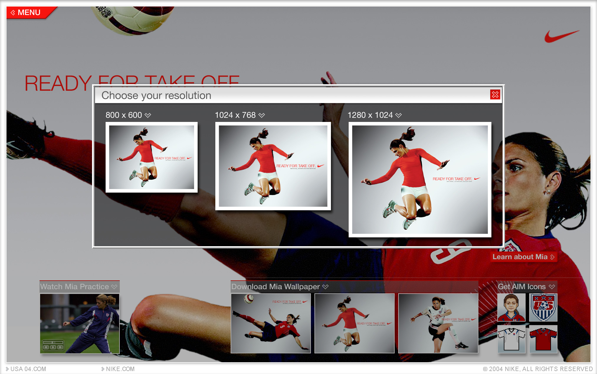
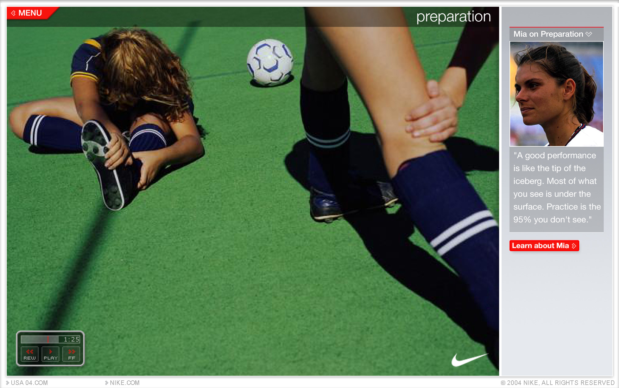
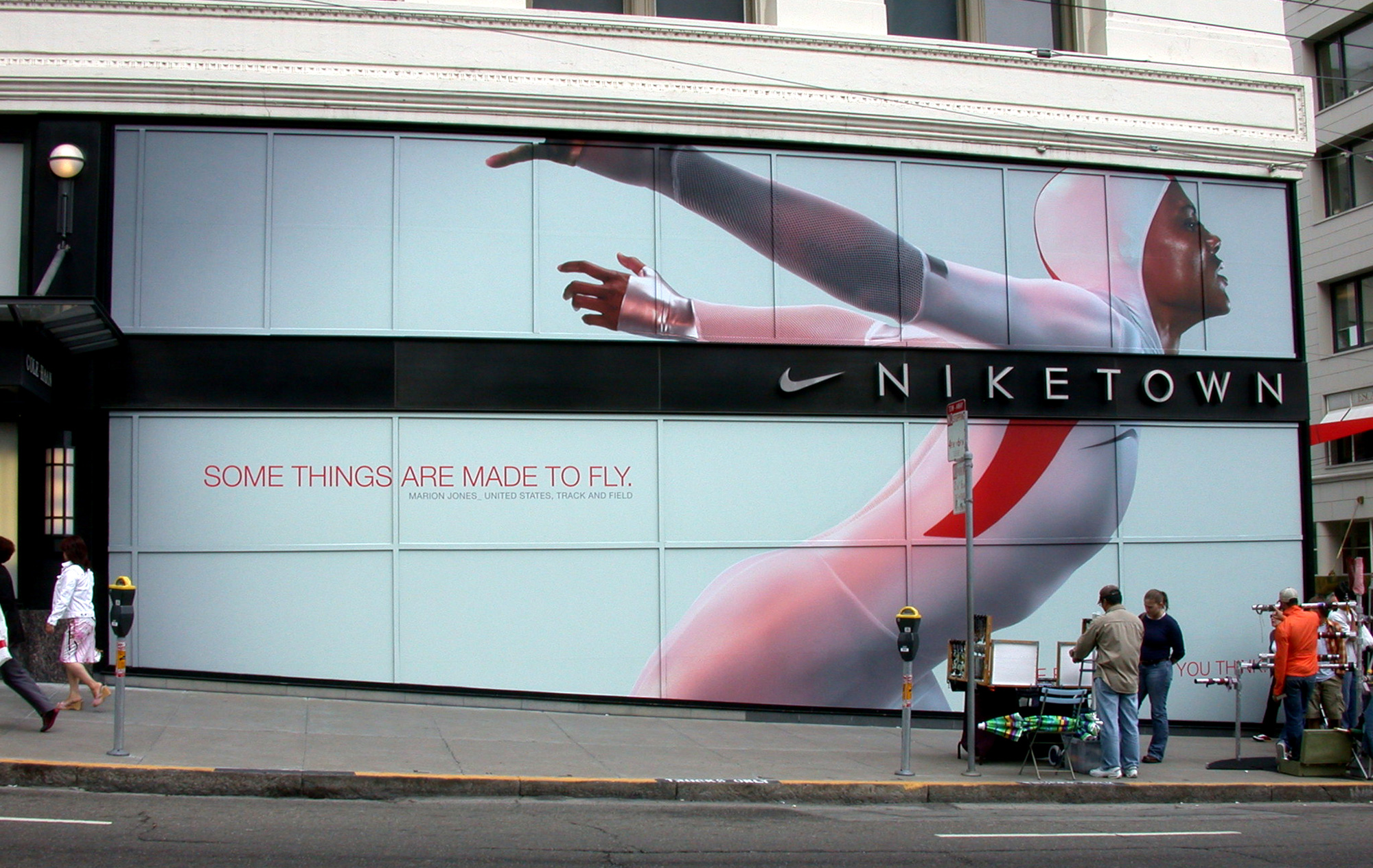
[↓] Nike's theme for the 2004 Summer olympics was "Speed". The design language for the campaign emphasized photography of athletes in motion, white and red uniforms, and uppercase type in Nike's Victory font.
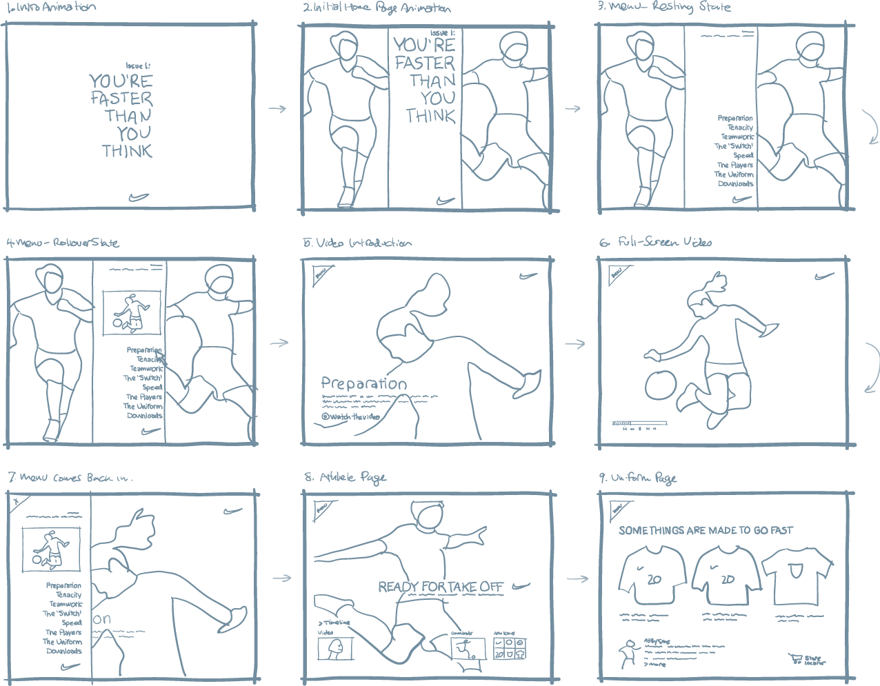
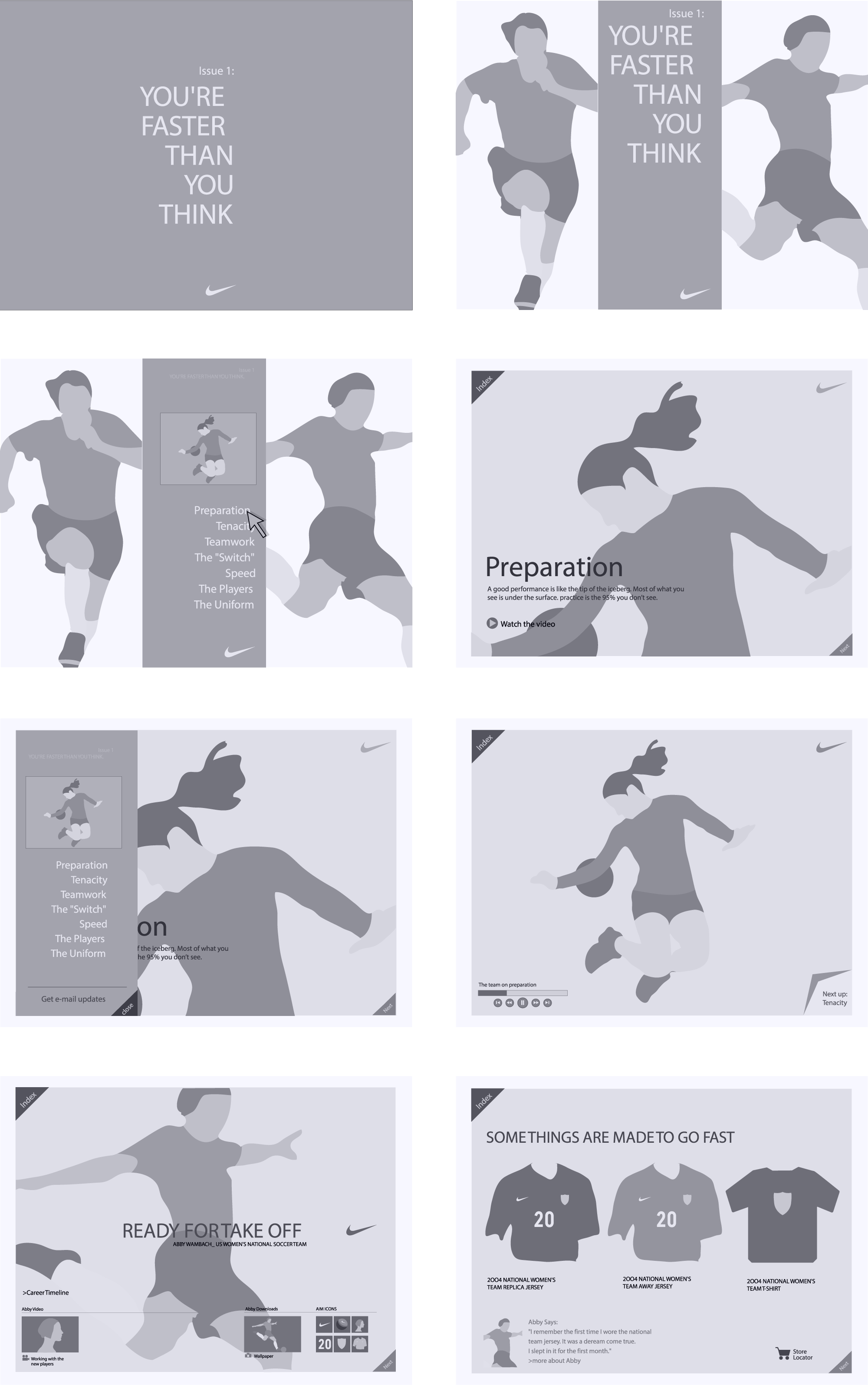
2. Wireframes
[↓] The wireframes made reference to the photography that was available for the project. This level of fidelity enabled us to work through the layout and get quick approval from decision-makers.
3. Visual Designs
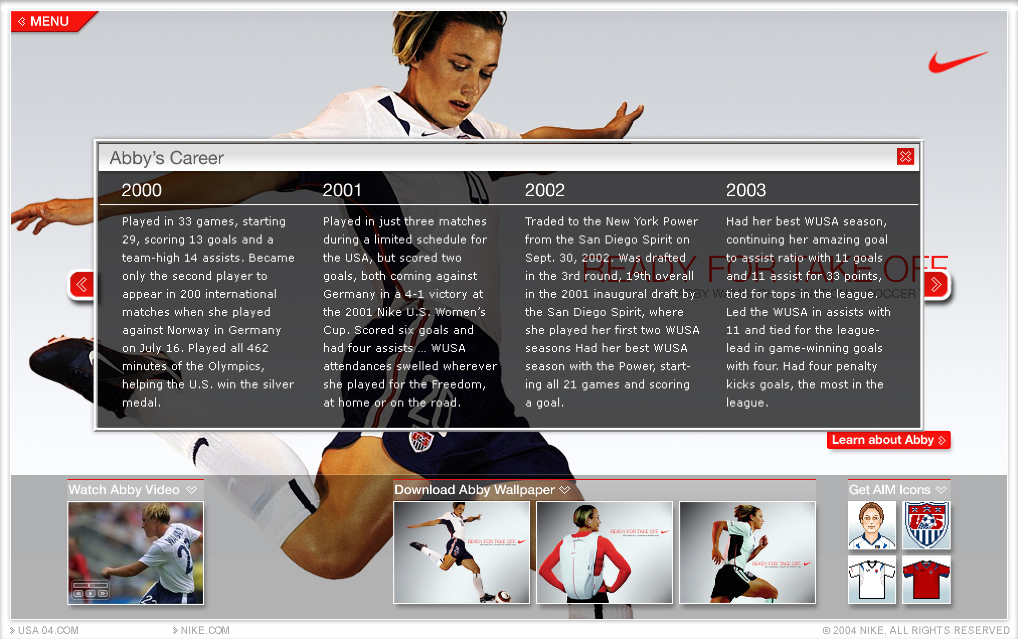
[↓] Doing work for Nike is very inspiring, but there's a danger of over-designing things. This site's photography was its strength, so we made sure the visual design served to enhance, rather than compete.