In 2001, Behr Paint wanted to increase its presence in Home Depot by launching an interactive kiosk. Our challenge was to create an engaging self-serve experience that could help people with the task of choosing paints, selecting colors, visualizing them, and calculating paint quantities.
Behr ColorSmart Kiosk
In 2001, Behr Paint wanted to increase its presence in Home Depot by launching an interactive kiosk. Our challenge was to create an engaging self-serve experience that could help people with the task of choosing paints, selecting colors, visualizing them, and calculating paint quantities.
1. Context
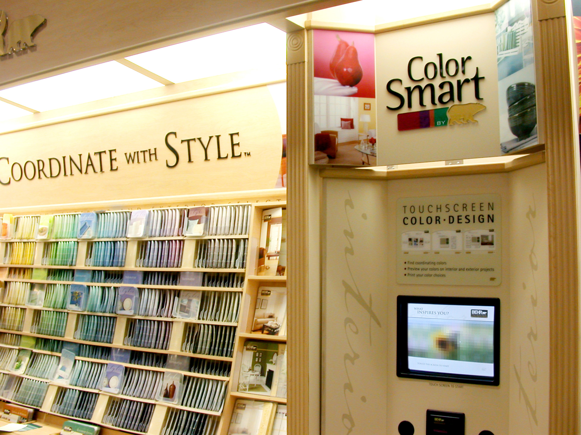
[↓] The Behr ColorSmart Kiosk would be competing for attention in busy Home Depots across North America. It had to be intuitive to use and help people find paint color choices in just a couple of minutes.
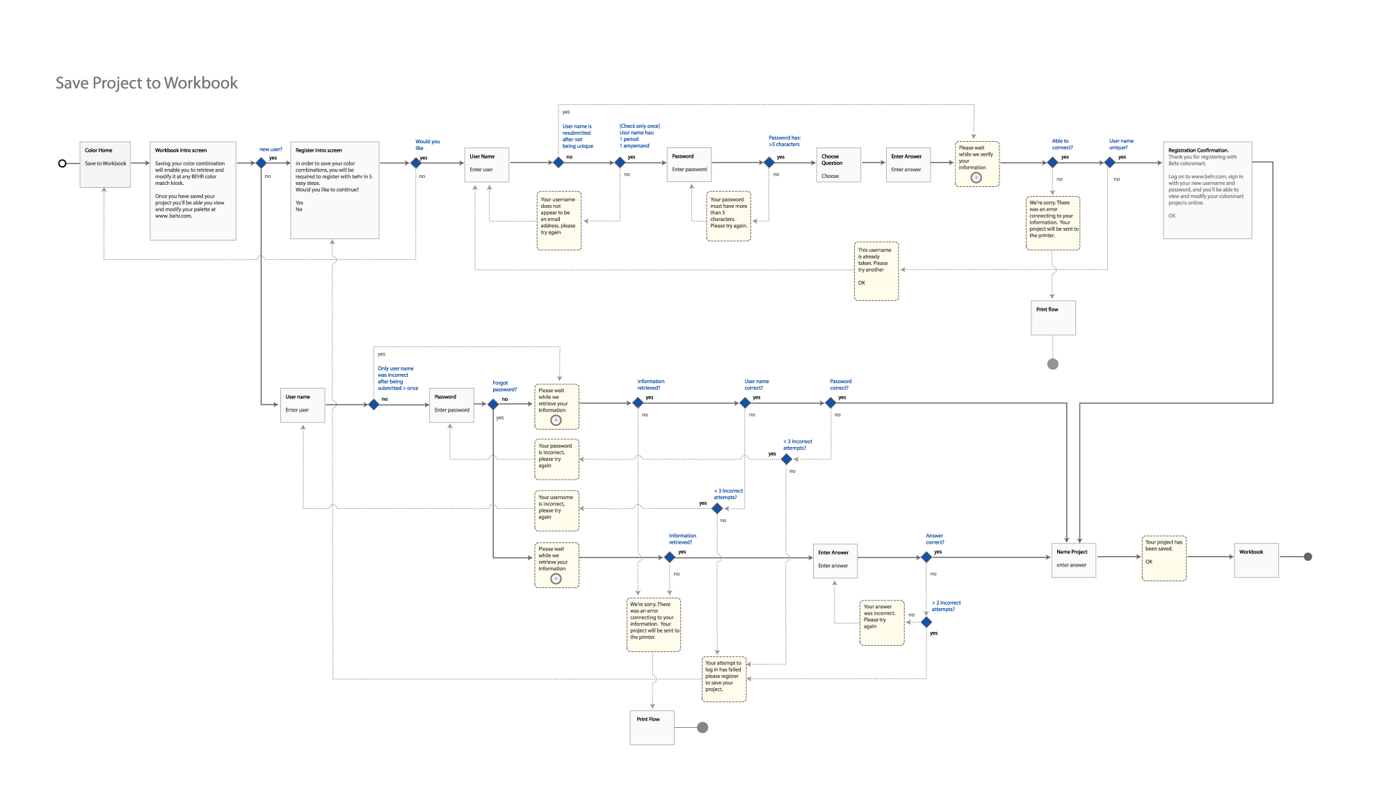
2. Interaction Planning
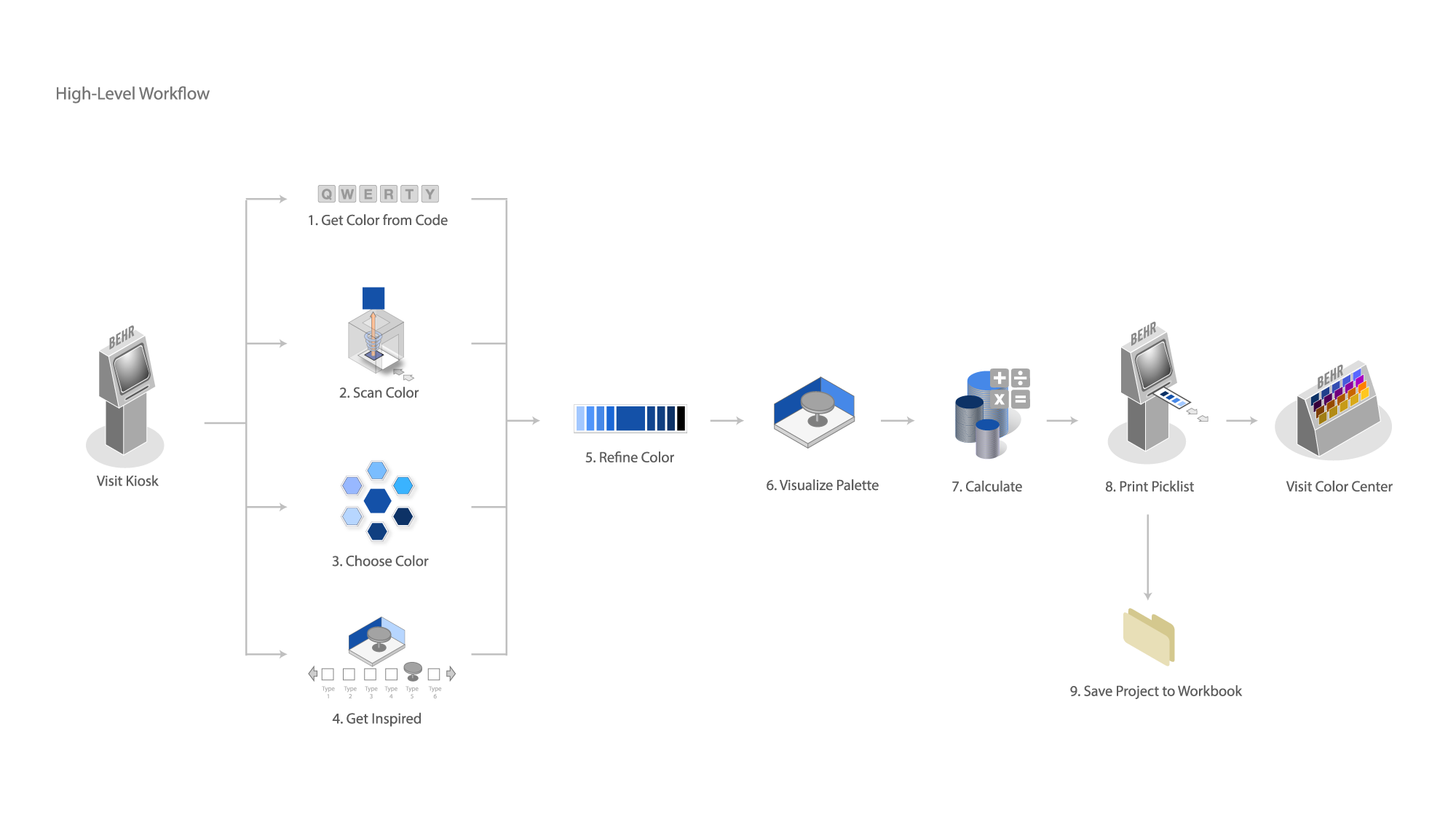
[↓] It was important to help our team get a handle on the scope of work. There were a lot of conditionals and edge-cases to consider. Thoroughly mapping the interactions and unhappy path states helped streamline the visual design and engineering work.
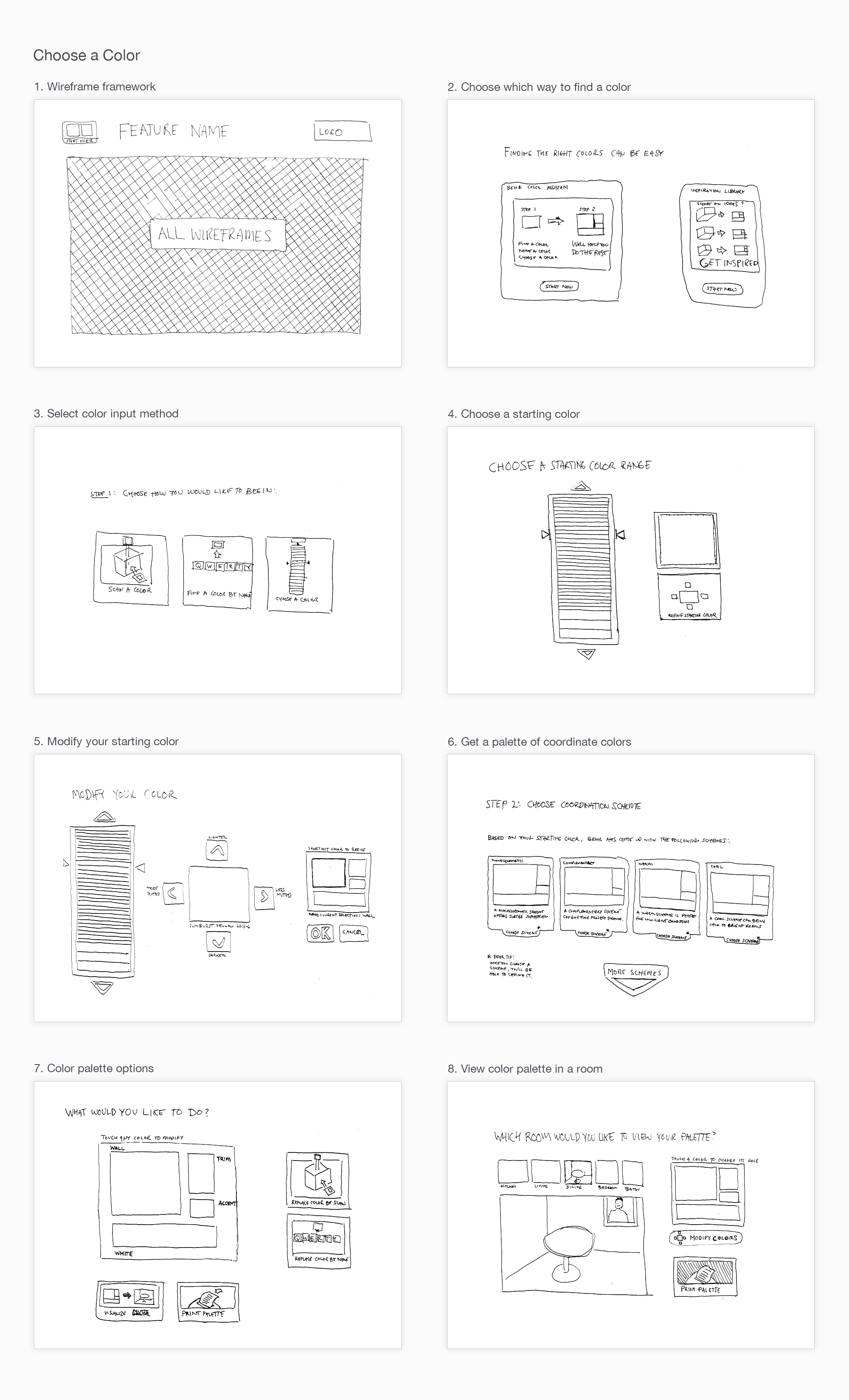
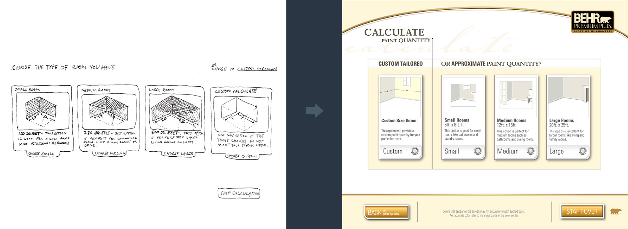
3. Interaction Design
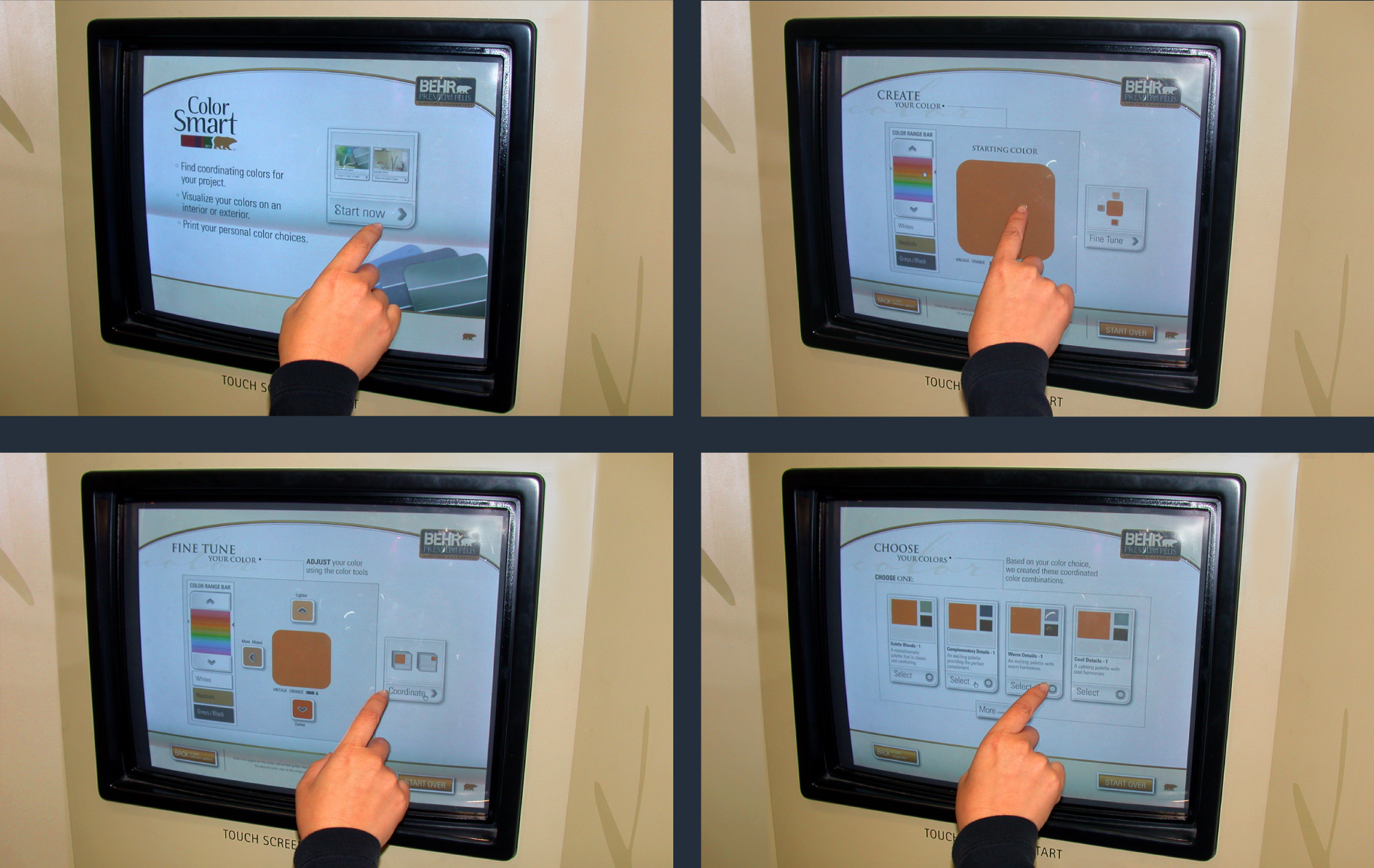
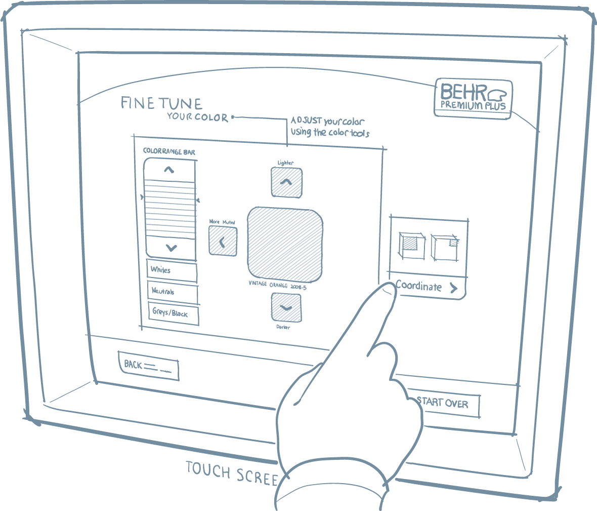
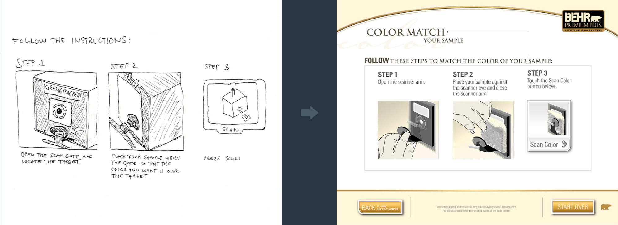
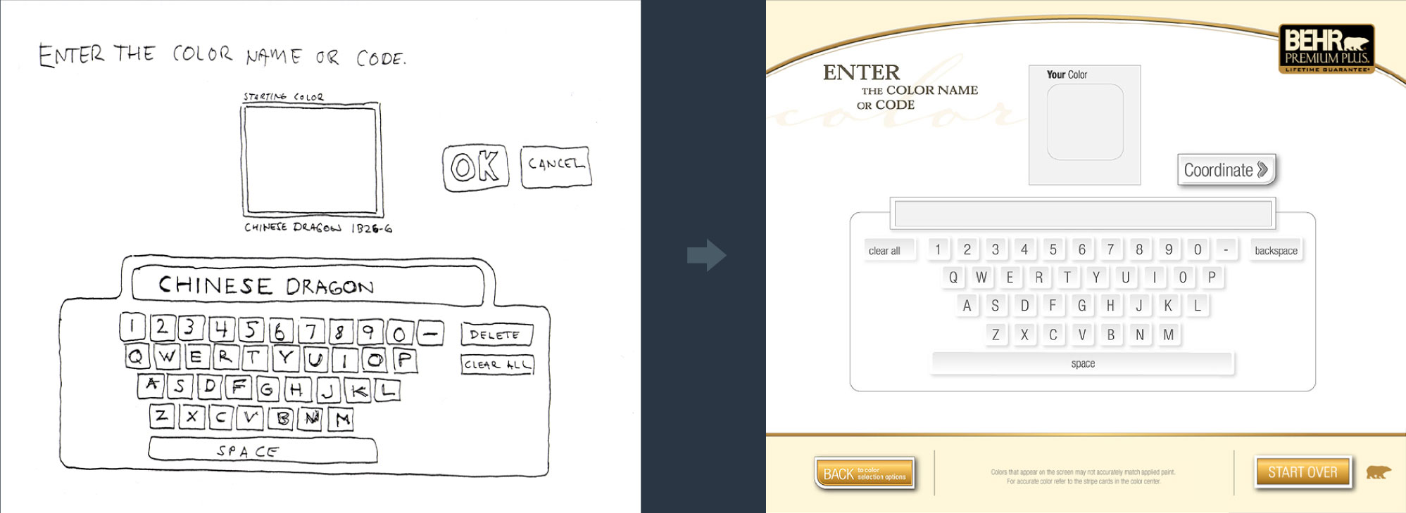
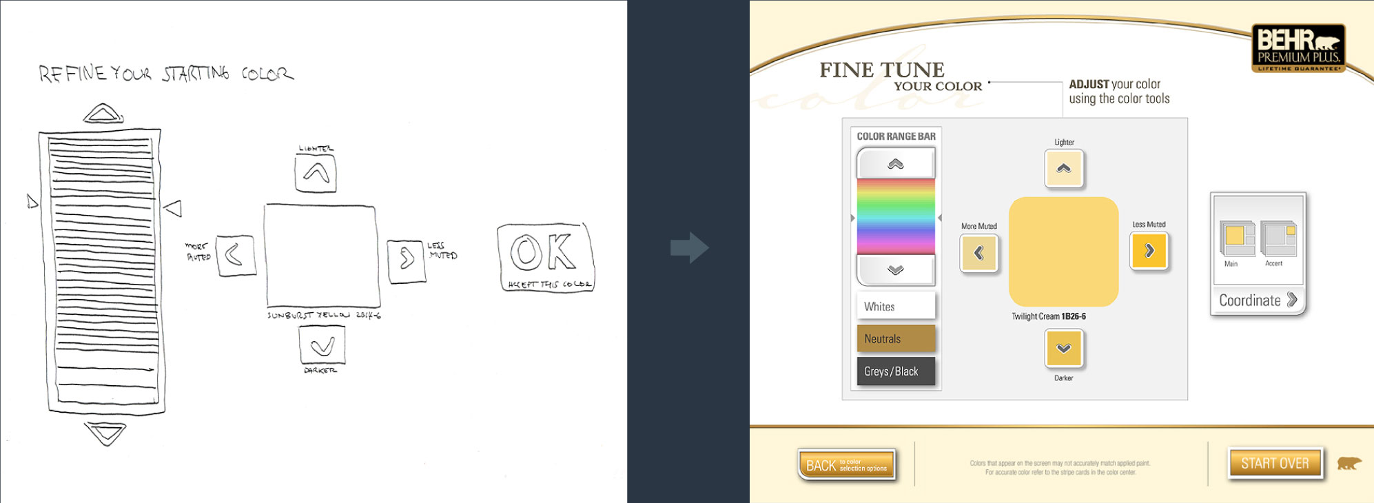
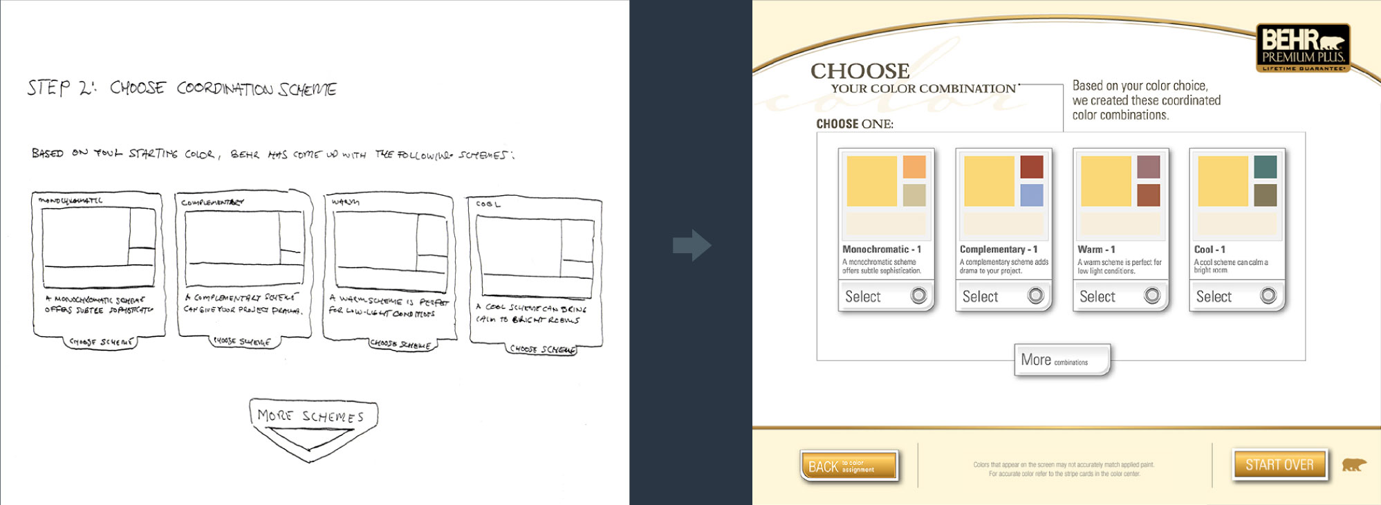
[↓] Interface ideas were sketched on paper at full-size. They were taped to a wall so that we could get a better sense about what the kiosk would feel like. This helped us uncover usability issues before moving to visual design. The basic organizing idea behind the kiosk was one task per screen with new choices being progressively disclosed. Animations would provide continuity as the user moved through the color selection process.
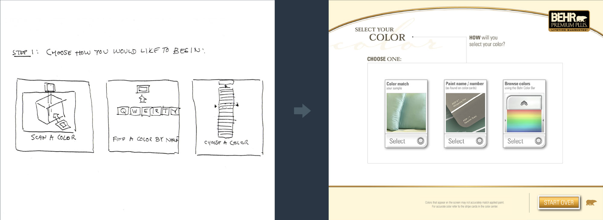
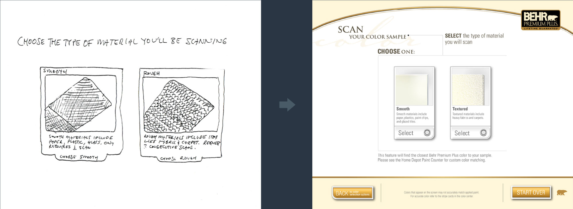
4. From Sketches to Visual Design
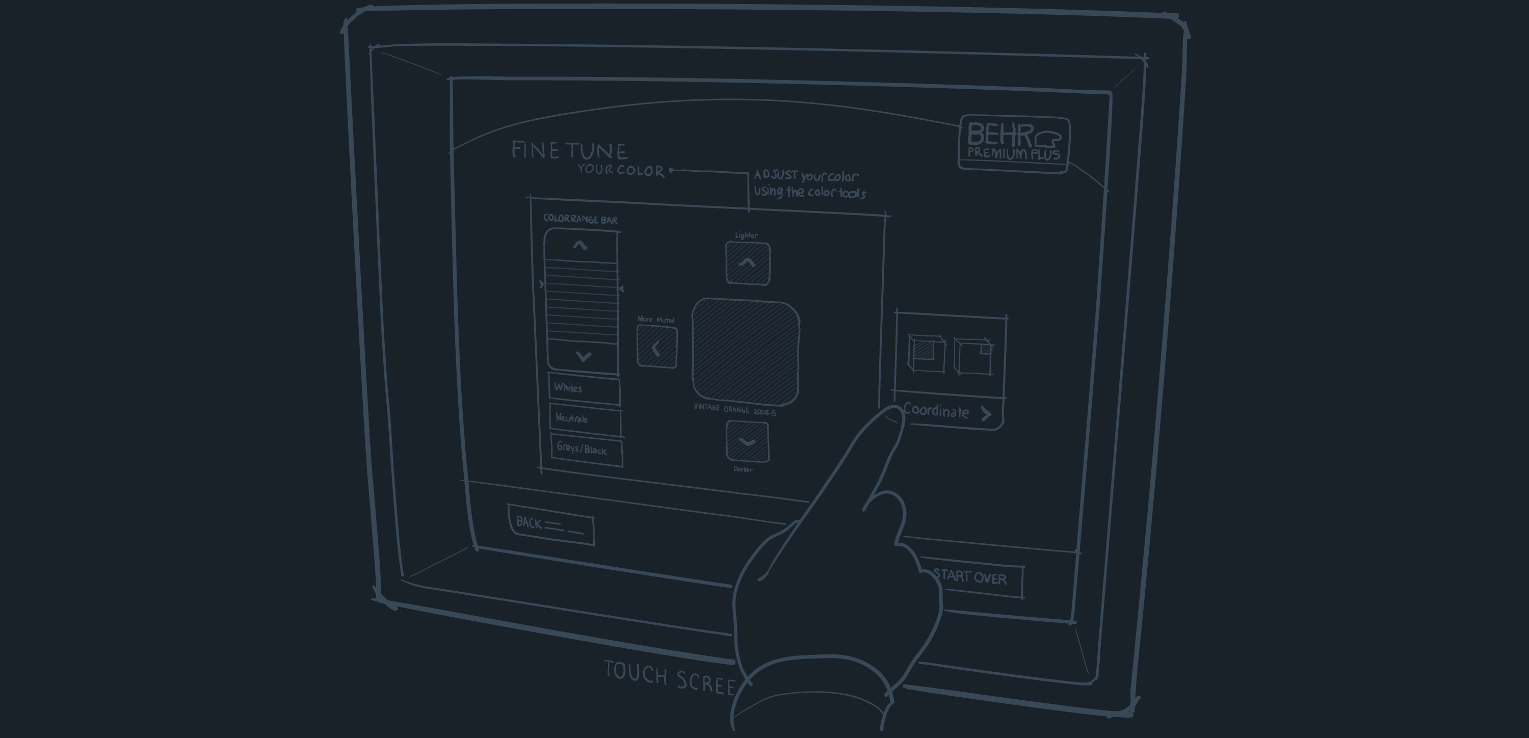
[↓] Once the interaction design had been finalized, the project moved to visual design. While some of the details changed, the overall structure described in the sketches carried through to the finished product. Visual design credit: Joshua Fehr.
5. ColorSmart Kiosk
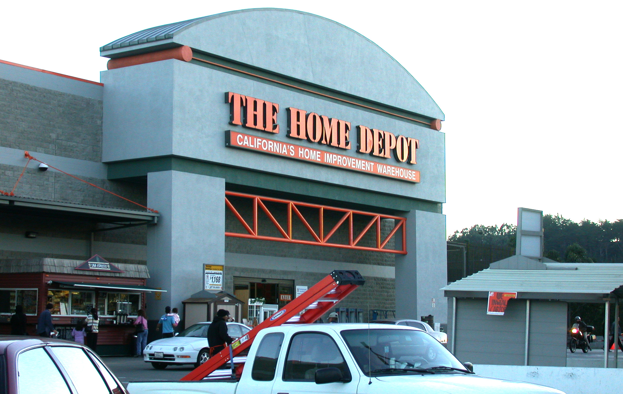
[↓] Here's the finished product in the Behr color center at Home Depot. The user's color choices would be incorporated into calls to action. At the end of the process, the user would receive a printout of their color choices and had the option of saving their choices for viewing and exploration at home.